Redesign
Moodle
 4 weeks
  Group
Group 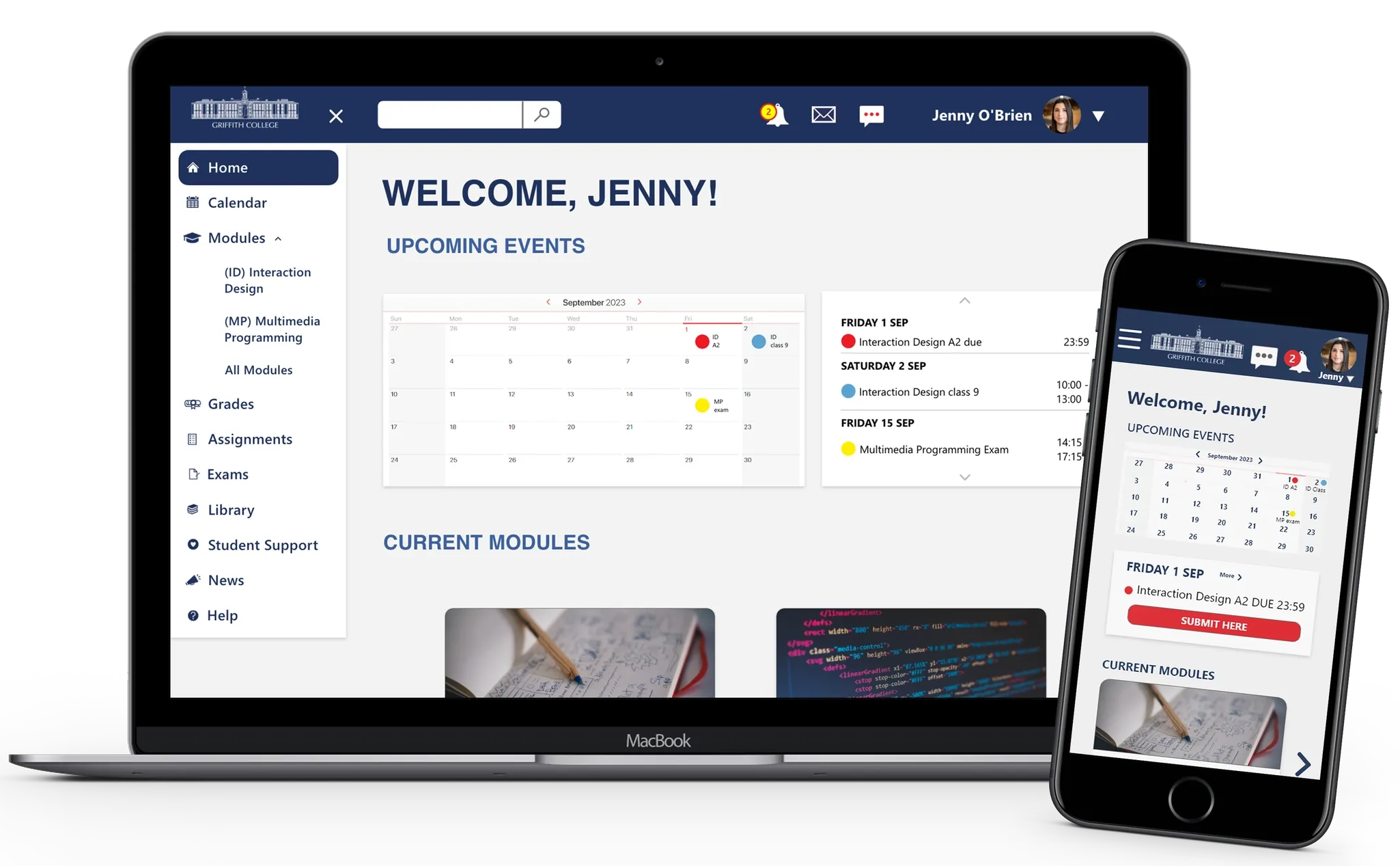


Competitor audit | Usability test
Interaction design | Responsive design
Overview
Griffith College's Student Learning Platform received poor student feedback on features, usability, and design. This project aims to redesign it to improve student experience and engagement.
Challenges
- Large amount of menus
- Sections without standard format
- Colour red conveys errors
- Design is not intuitive
Problem
Griffith College's students are unhappy with the existing learning platform. Griffith College requires a software of easy use that help students to achieve their academic goals.
How might we improve user's interaction with the platform?
Solution
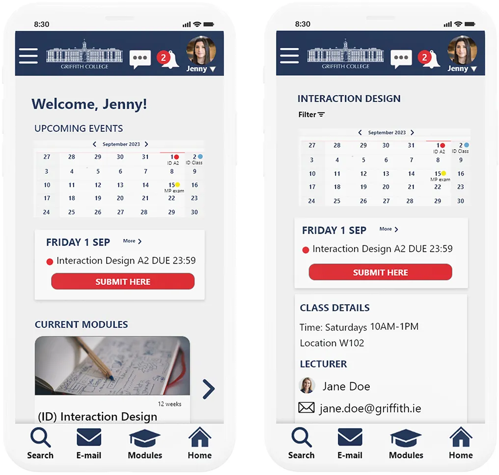
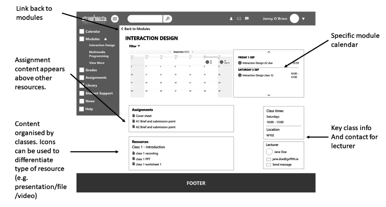
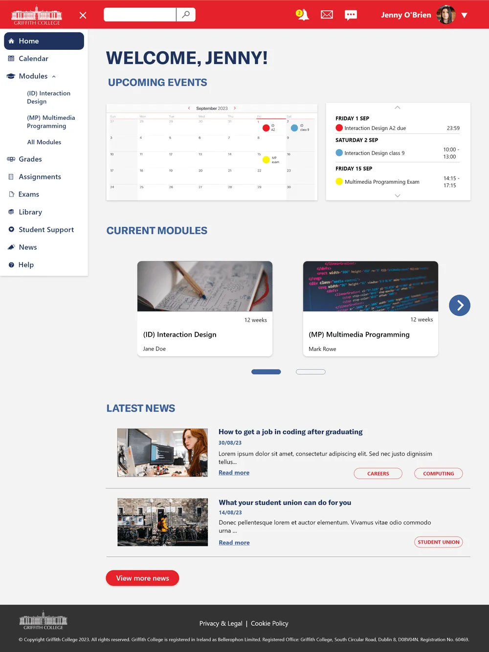
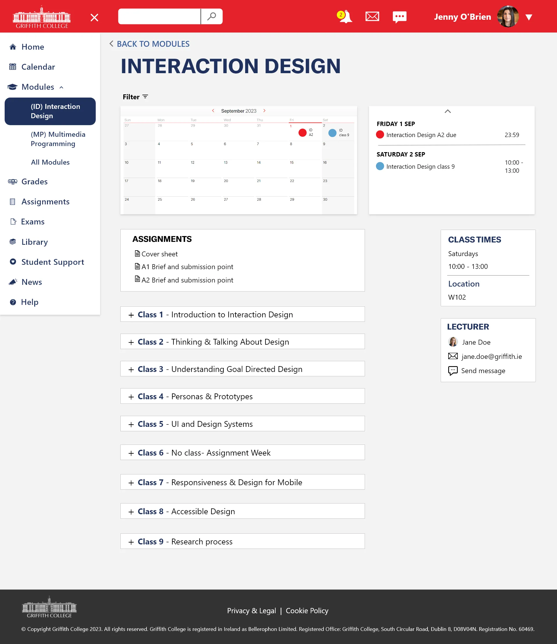
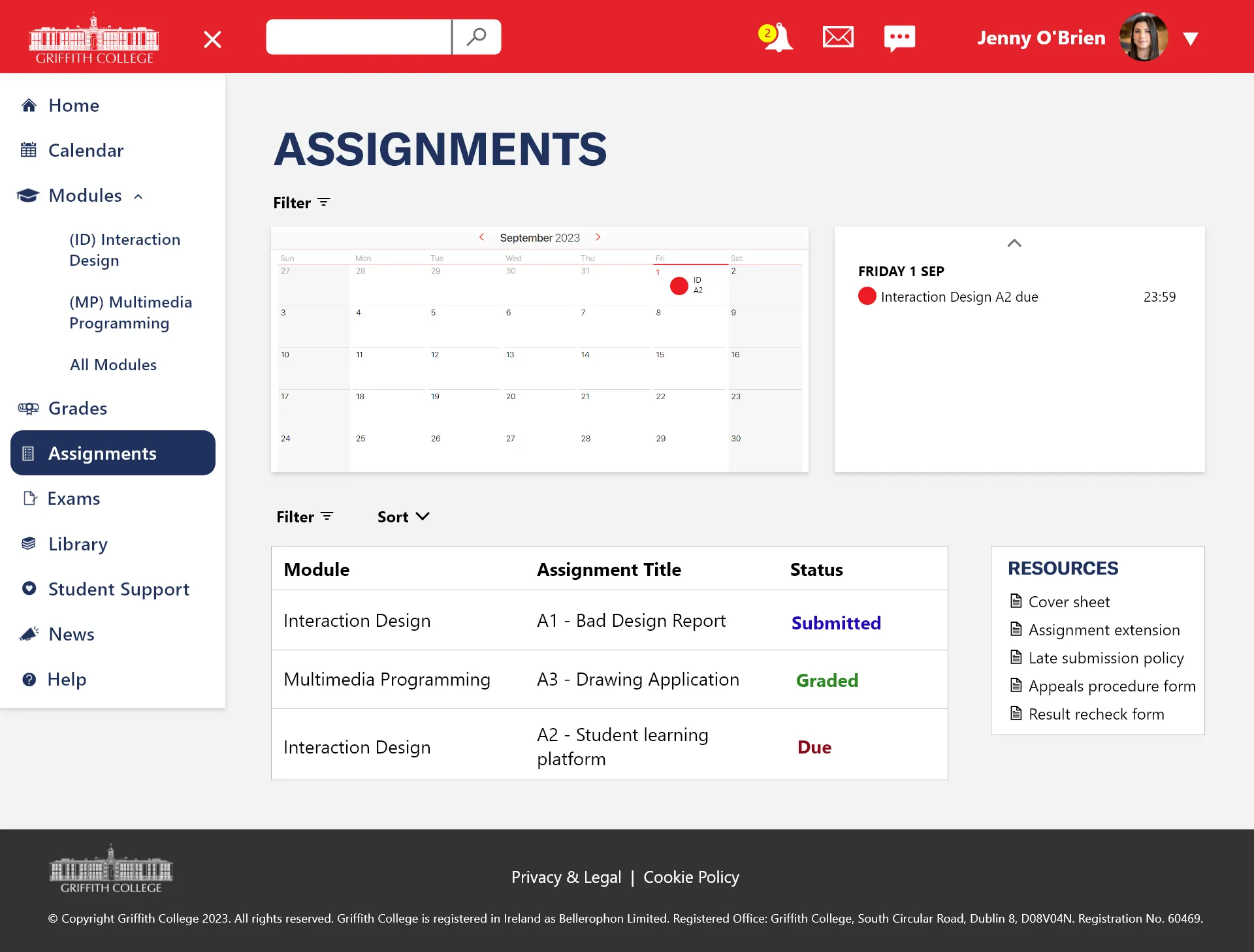
- Consolidate main tasks into one platform with simplified layout and navigation.
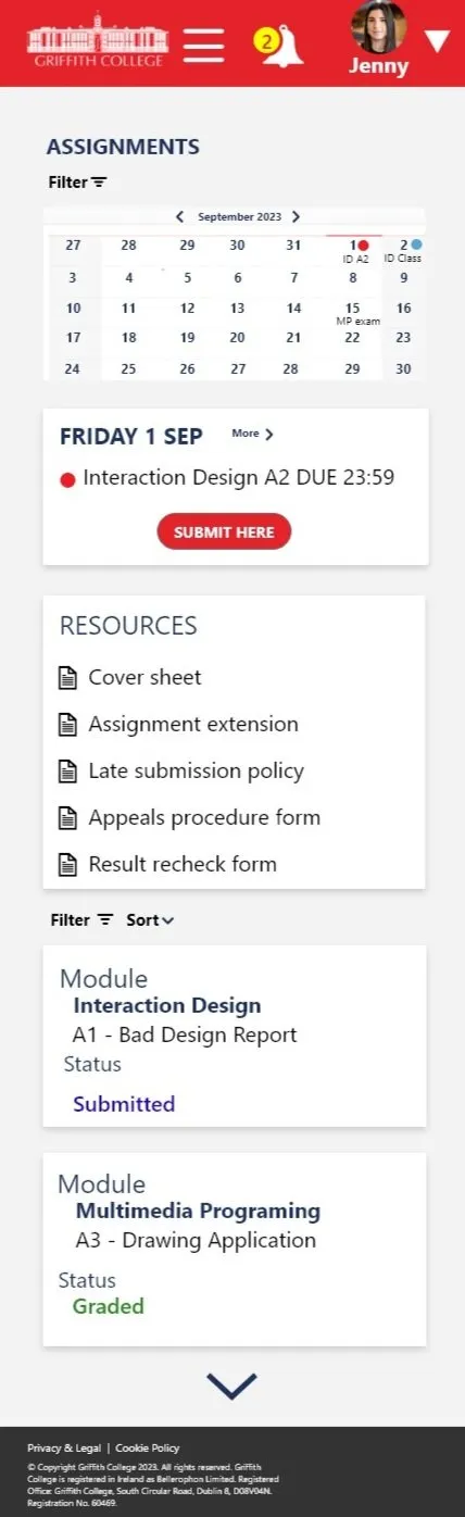
- Highlight exams, assignments, and upcoming classes on the homepage.
- Provide a responsive design for access anytime, anywhere.
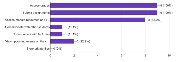
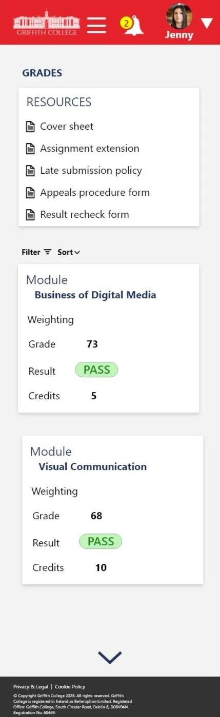
- Top 3 features used in Moodle:
- Access Grades
- Submit assignments
- Access module resources
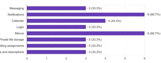
- Top 3 features that did not work as expected:
- Notifications
- Submit assignments
- Access module resources
- 4 interaction Design Moodle students
- 18 questions
- User's habits questions + college habits and user's experience with Moodle
- 4 person one-on-one tests with external students
- Approximately 30 minutes
- Users were given 10 users that had no experience with Moodle
- The goal was to test platform's learnability and intuitiveness
User's pain-points
- Unwanted features
- Inconsistent layout
- Information scattered across menus and lists
- Unclear help section
- Poor functionality of key features
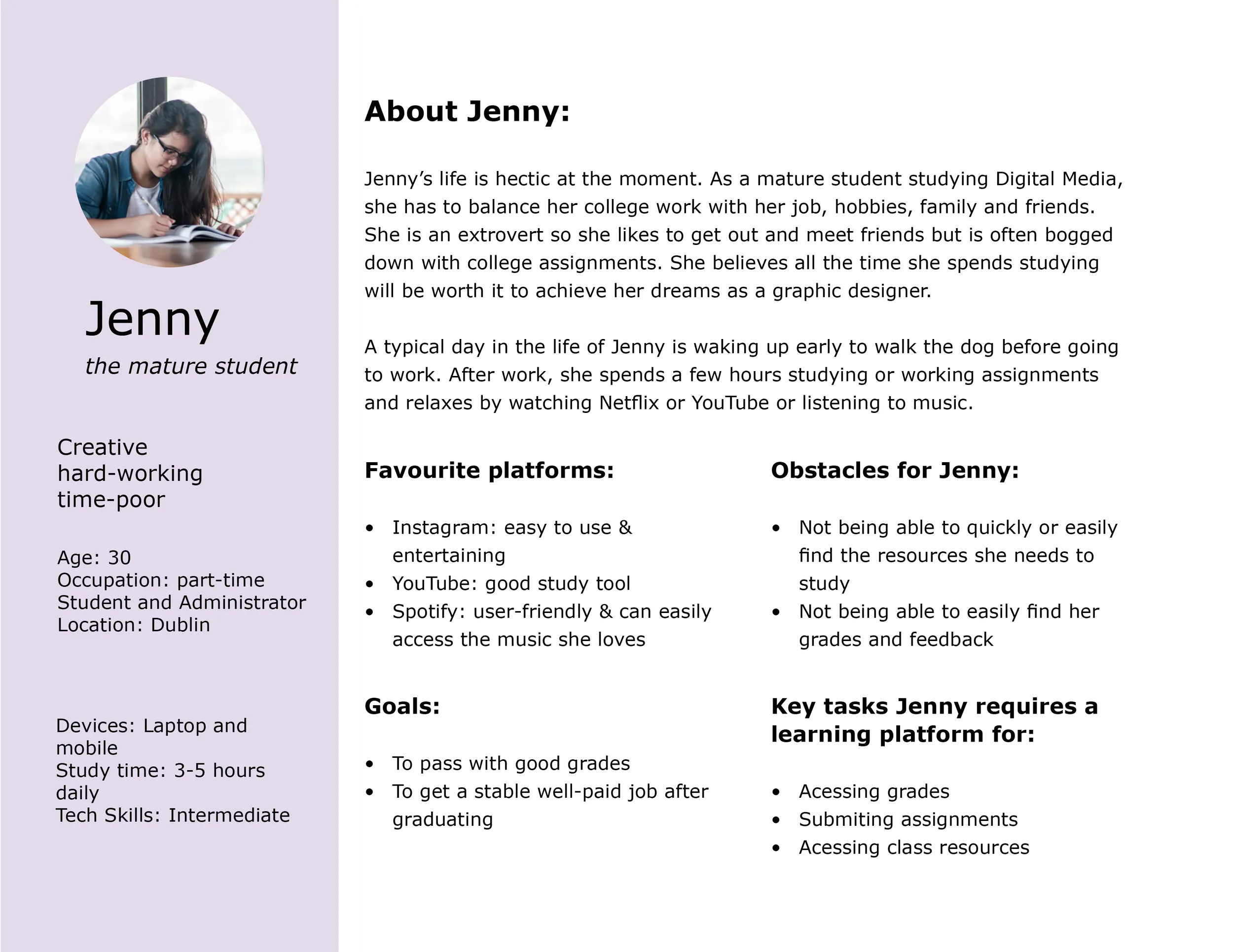
We created one user persona from the research to guide the design as user groups shared similar needs and goals.
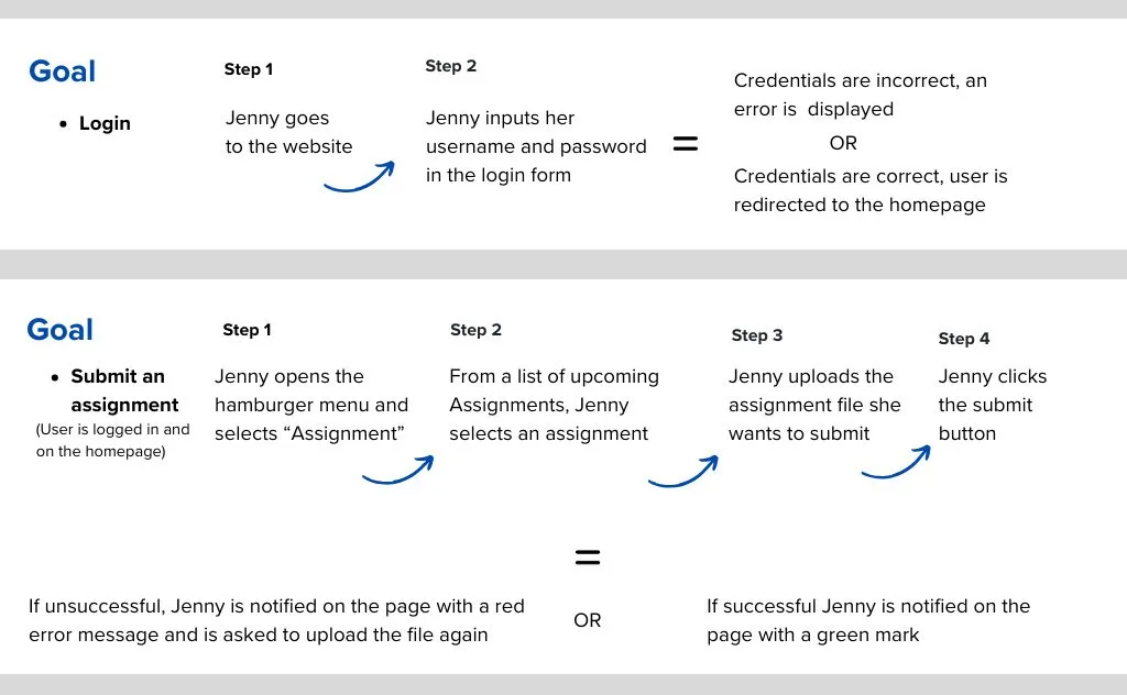
User scenarios were created to map task steps, focusing on faster and clearer processes based on research insights.
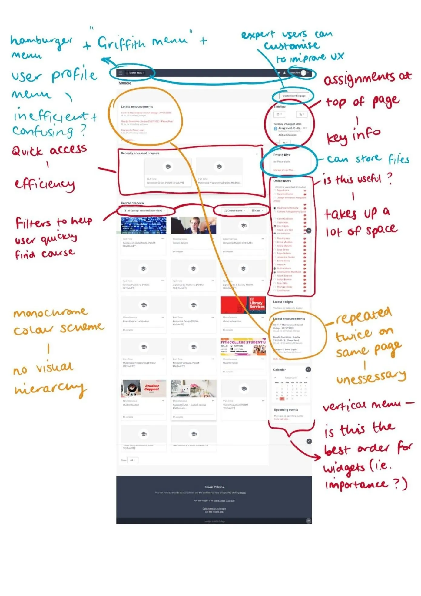
Strengths: clean layout, efficient user menu.
Weaknesses: unnecessary information in Homepage, distracting content in Modules.
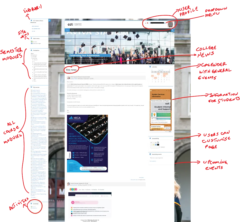
Strengths: easy access to "Assignments", filters help to find courses quickly.
Weaknesses: low distinction between sections, reporters created on the same mon, ans all hierarchy in the first.
Colours
Primary colours
Secondary colour
Neutral colours

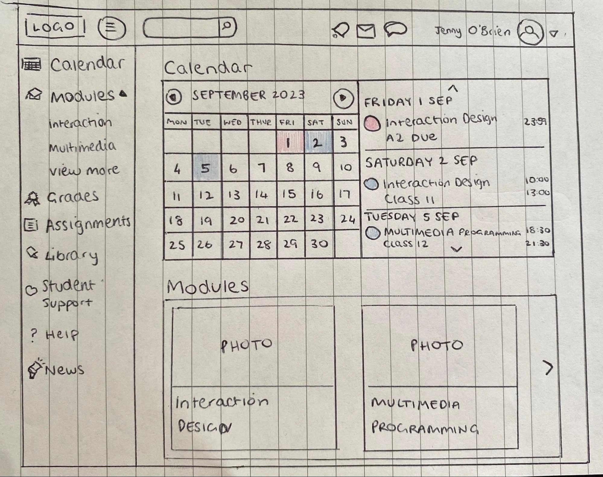
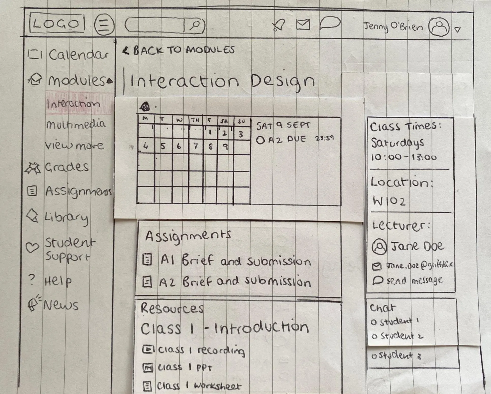
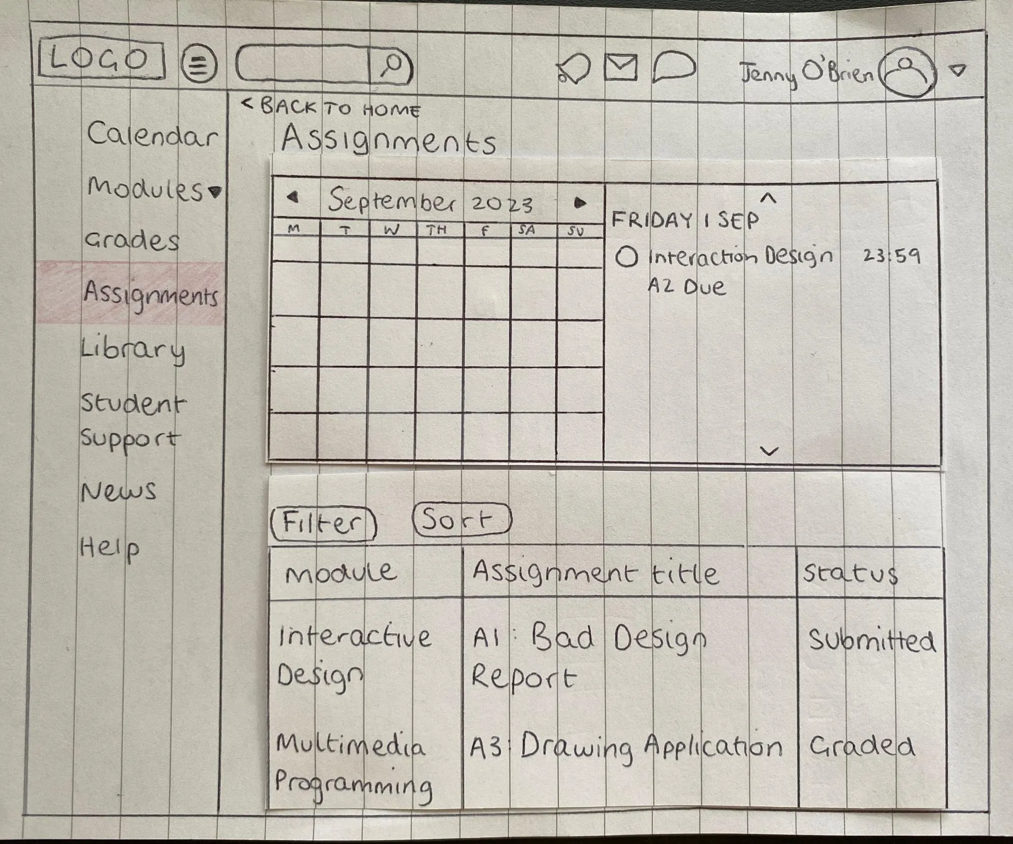
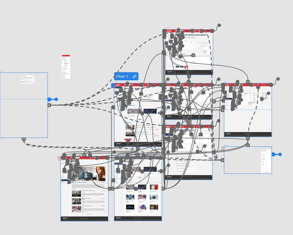
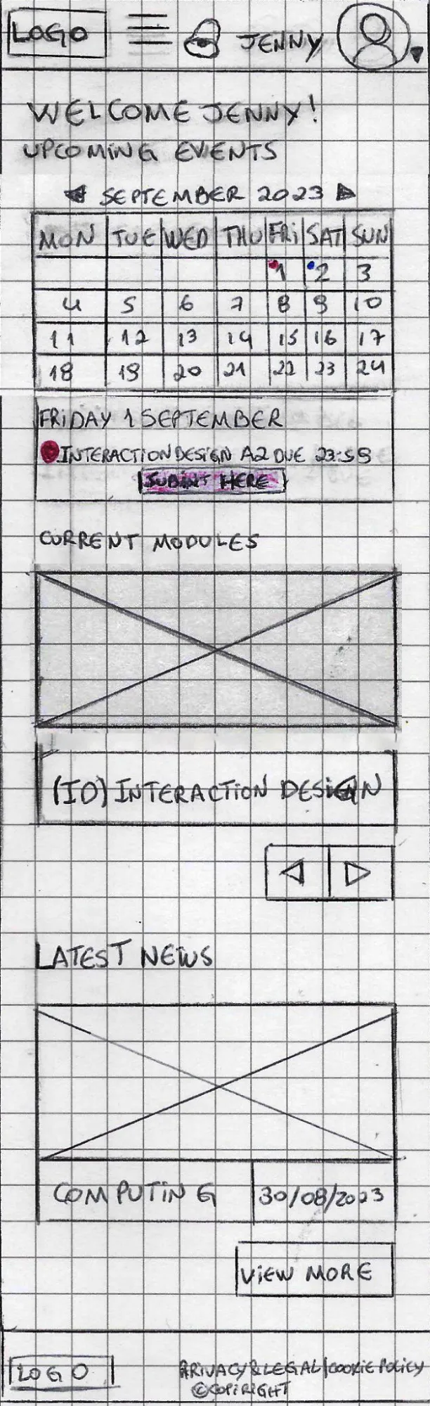
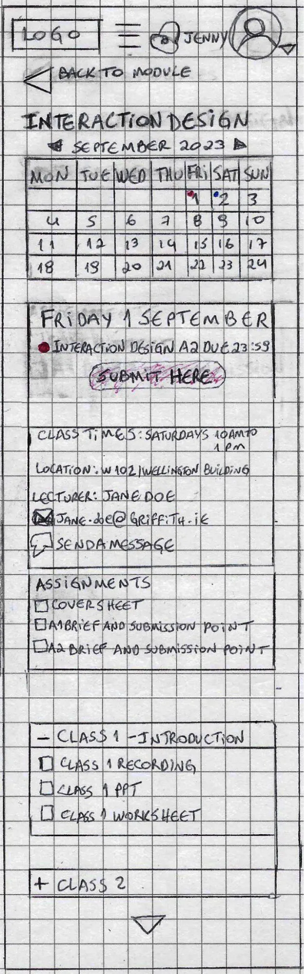
- We sketched rough designs of main pages for desktop and mobile, based on research showing students use both to access Moodle.
- On mobile, as space is more limited, the search bar is located as the first option under the hamburger menu.
- Messages and emails are in the user profile dropdown.
- Course uses a column layout with carousels for different sections.
- Artworks show more content and buttons help users navigate links.
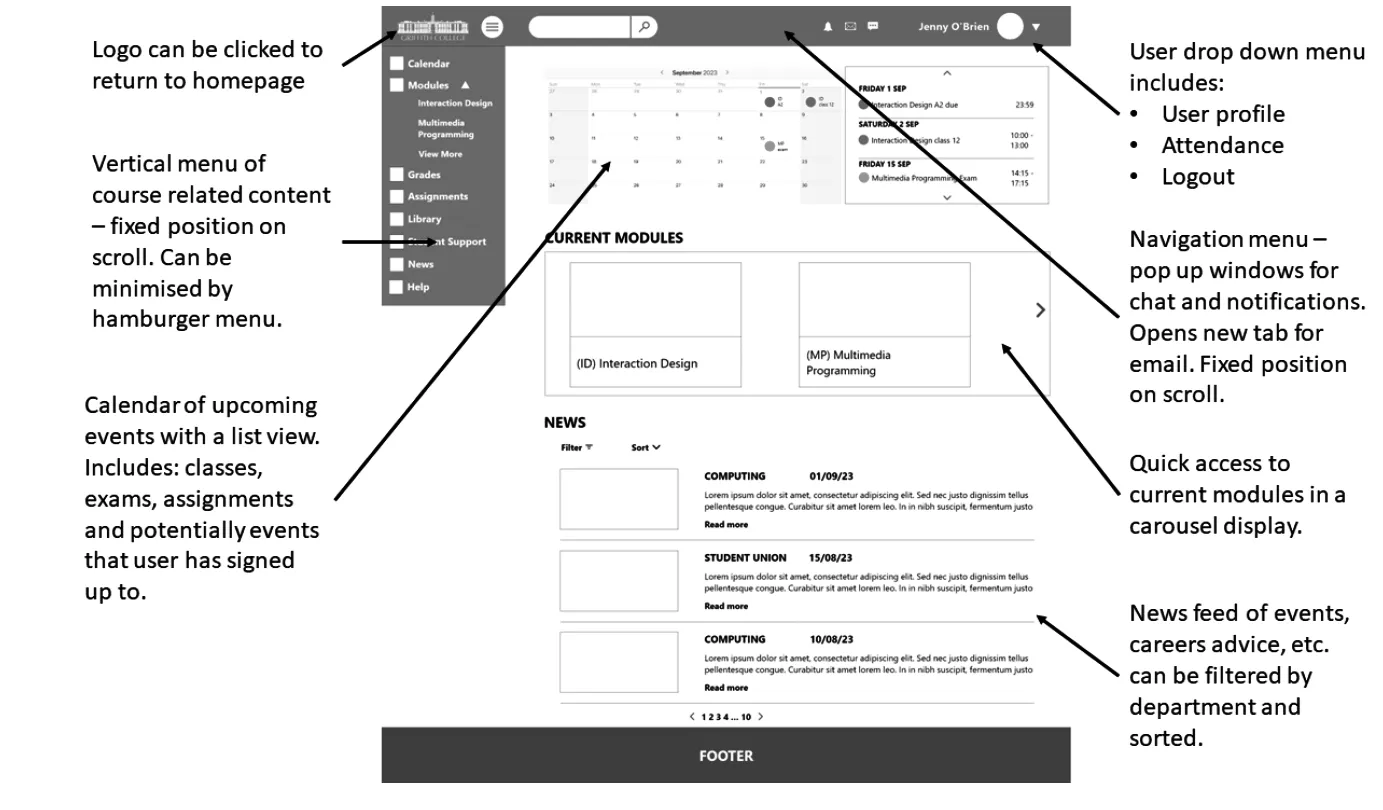
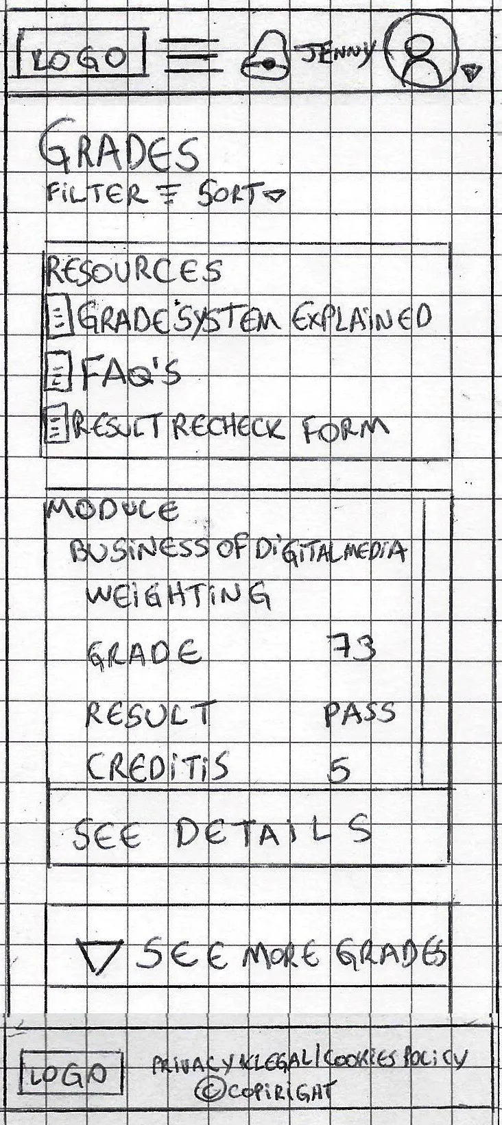
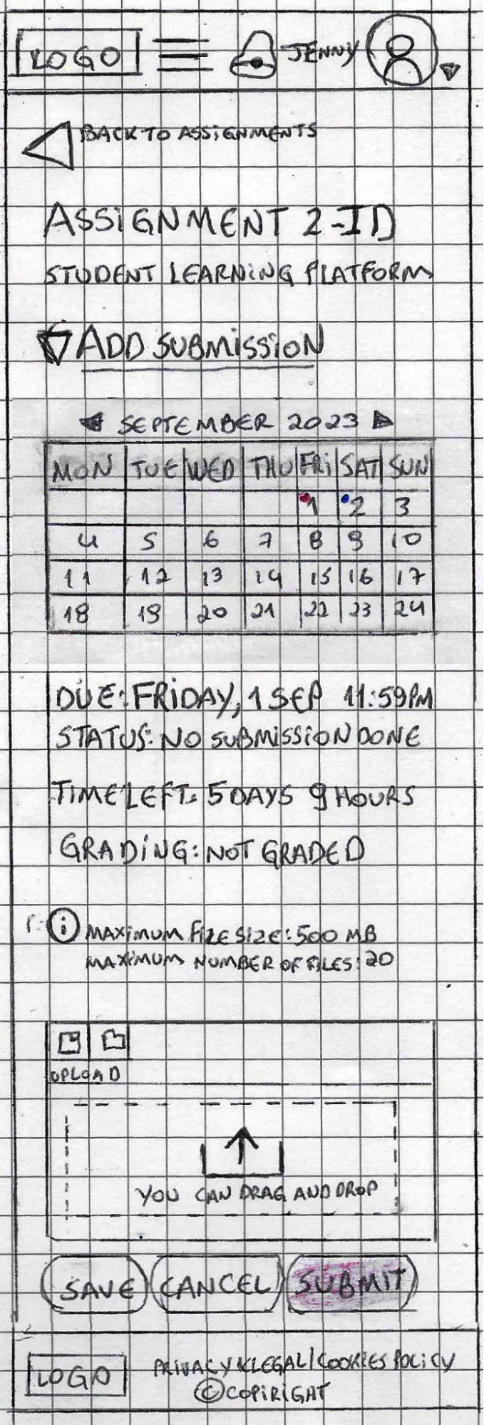
- Search bar at the top inside the burger menu.
- Burger menu after the top logo.
- Message and email under user profile menu.
- Carousel, buttons, and arrows added.
- Content is set in a column layout.
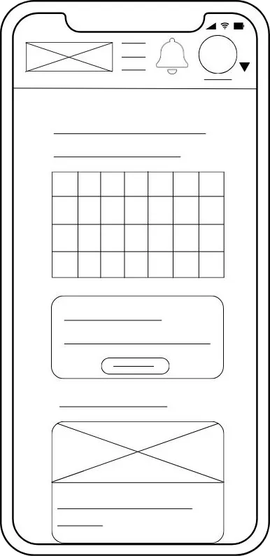
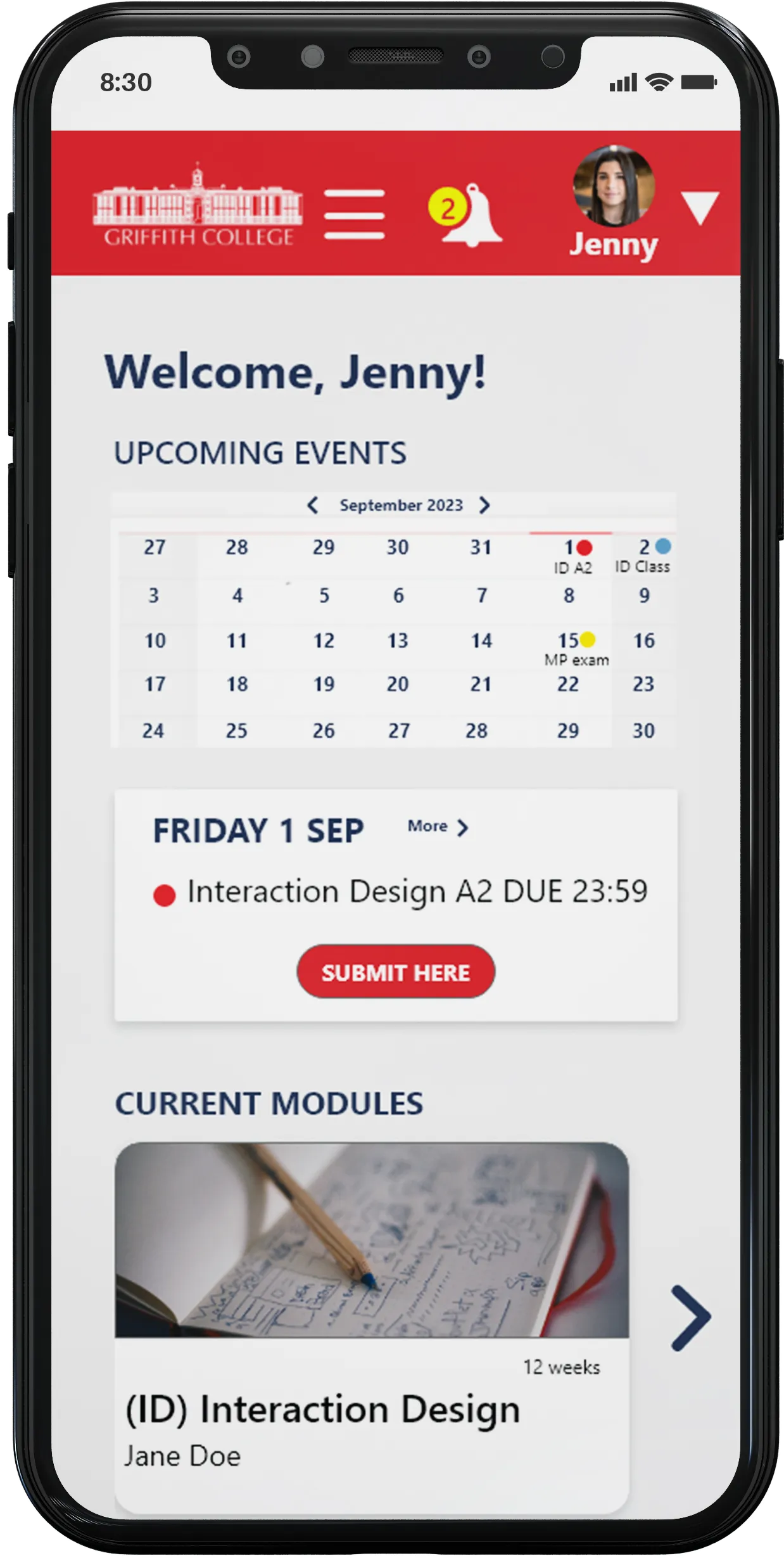
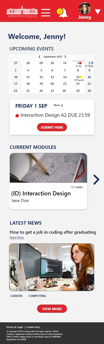
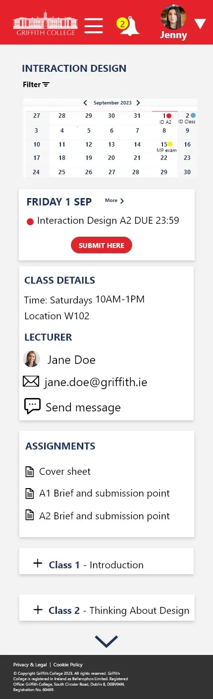
- Change top menu bar color to improve contrast with background.
- Add 2nd menu down the screen, so essential features are always visible.
- Move burger menu to the left top corner so users can easily open it.