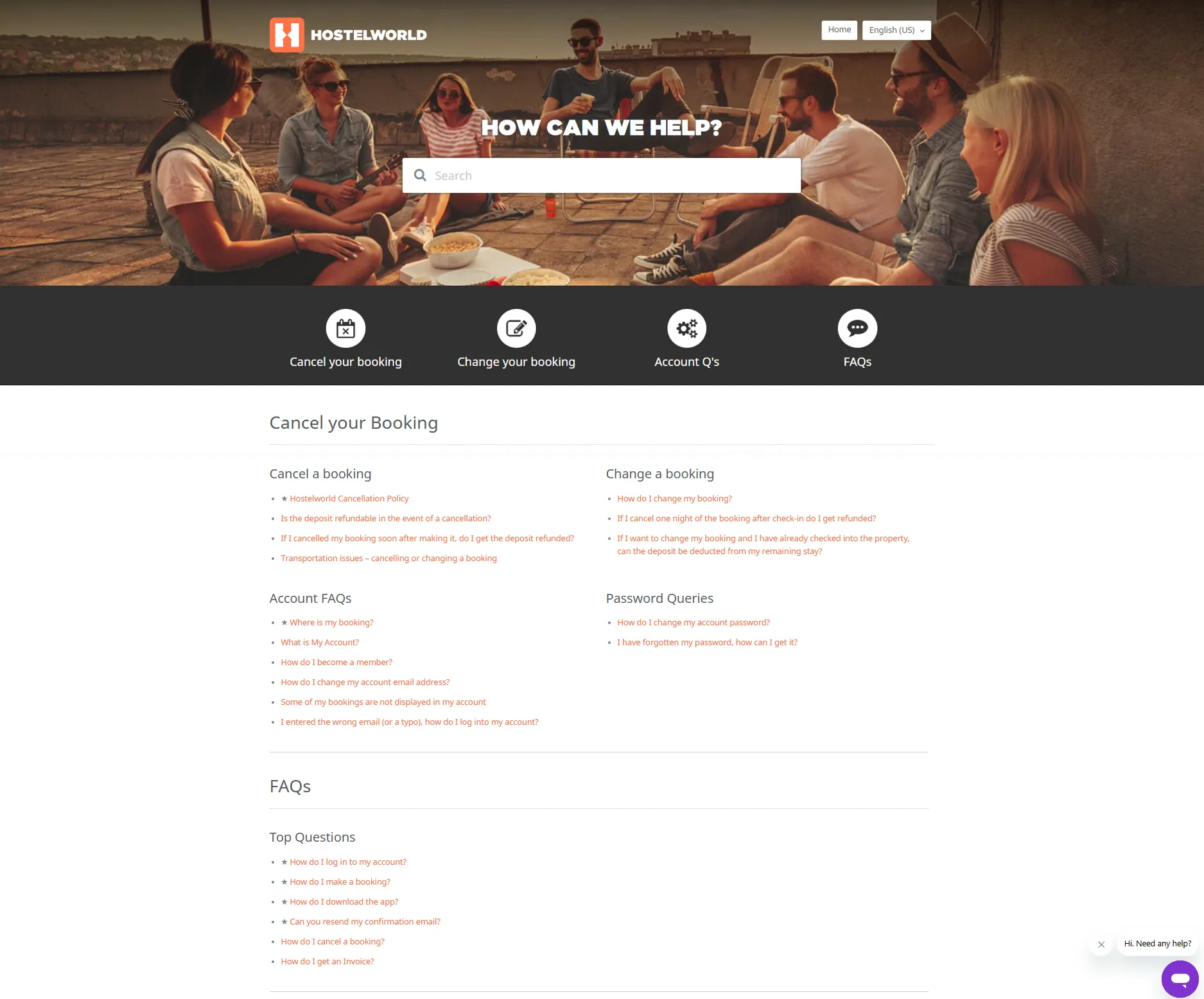
- The Help Centre was built on Zendesk, limiting full design flexibility.
- To assist internal implementation by the customer service team, a customizable theme was required.
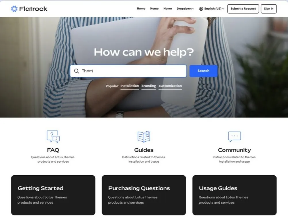
- I recommended the "Flatrock" theme for its flexibility and ease of use.
- The final design was adapted to the theme, balancing brand alignment with technical constraints.
Redesign
Hostelworld's Help Centre
 5 months
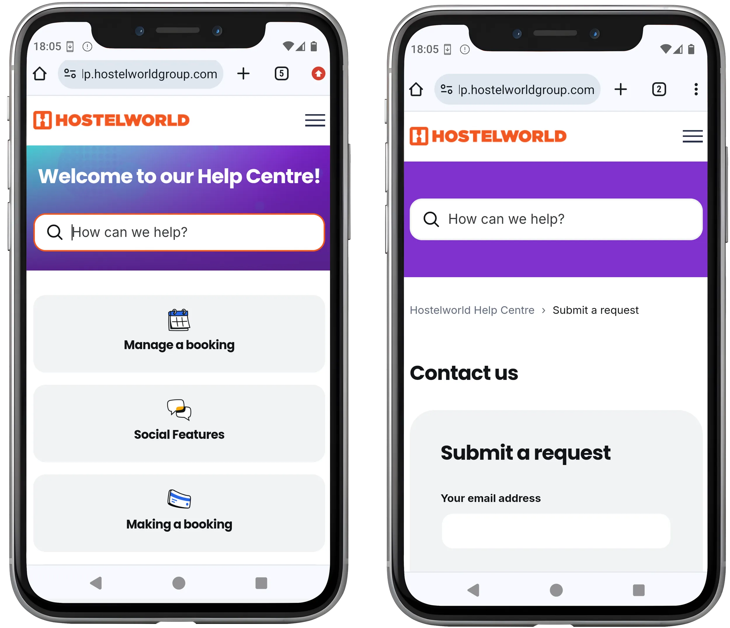
Tools 

Contribution
Project management | Competitor audit
Sitemap | Theme setup
Wireframes | Prototype
Sitemap | Theme setup
Wireframes | Prototype
My Role
Project Manager | UI Designer
Overview
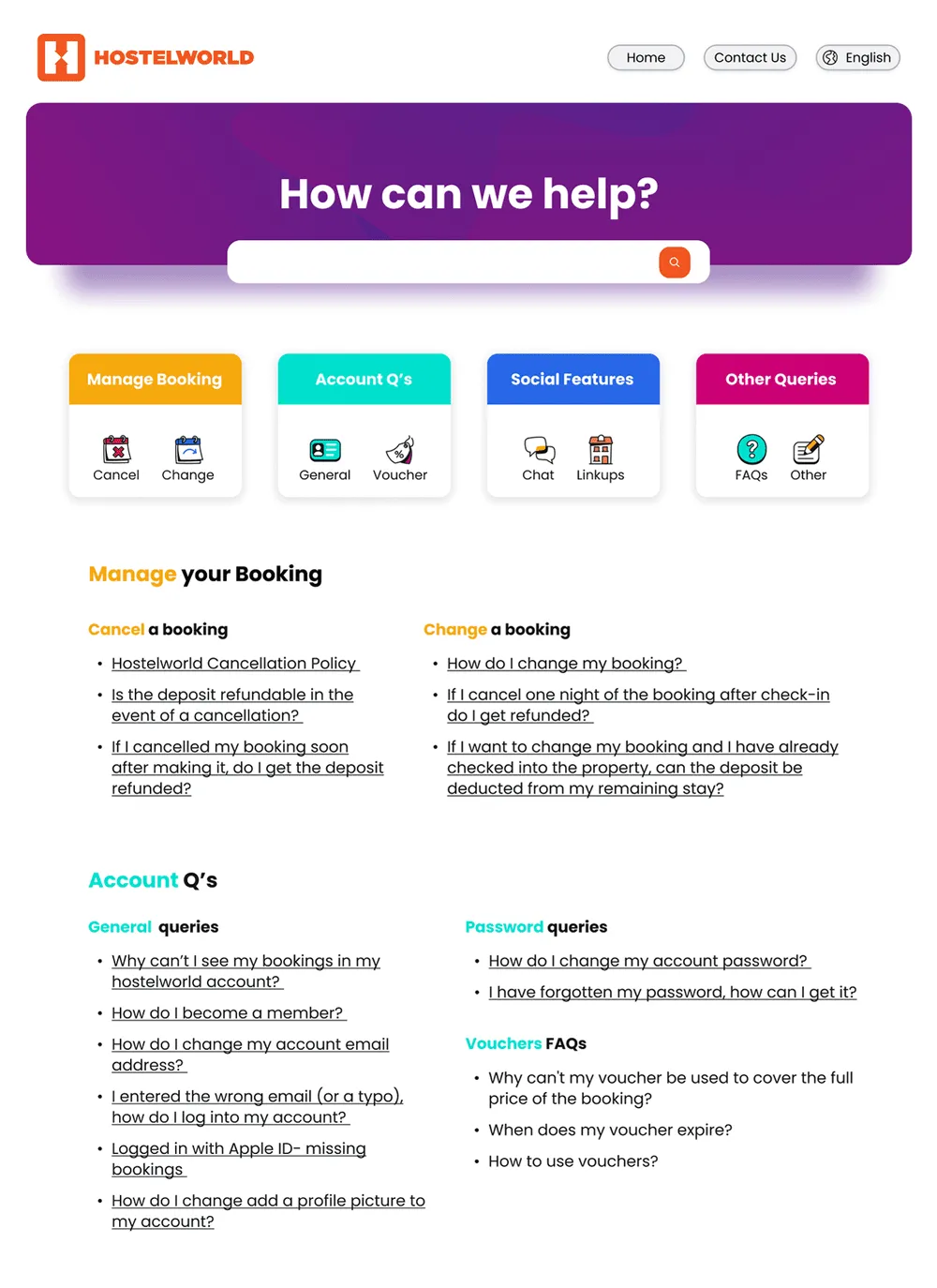
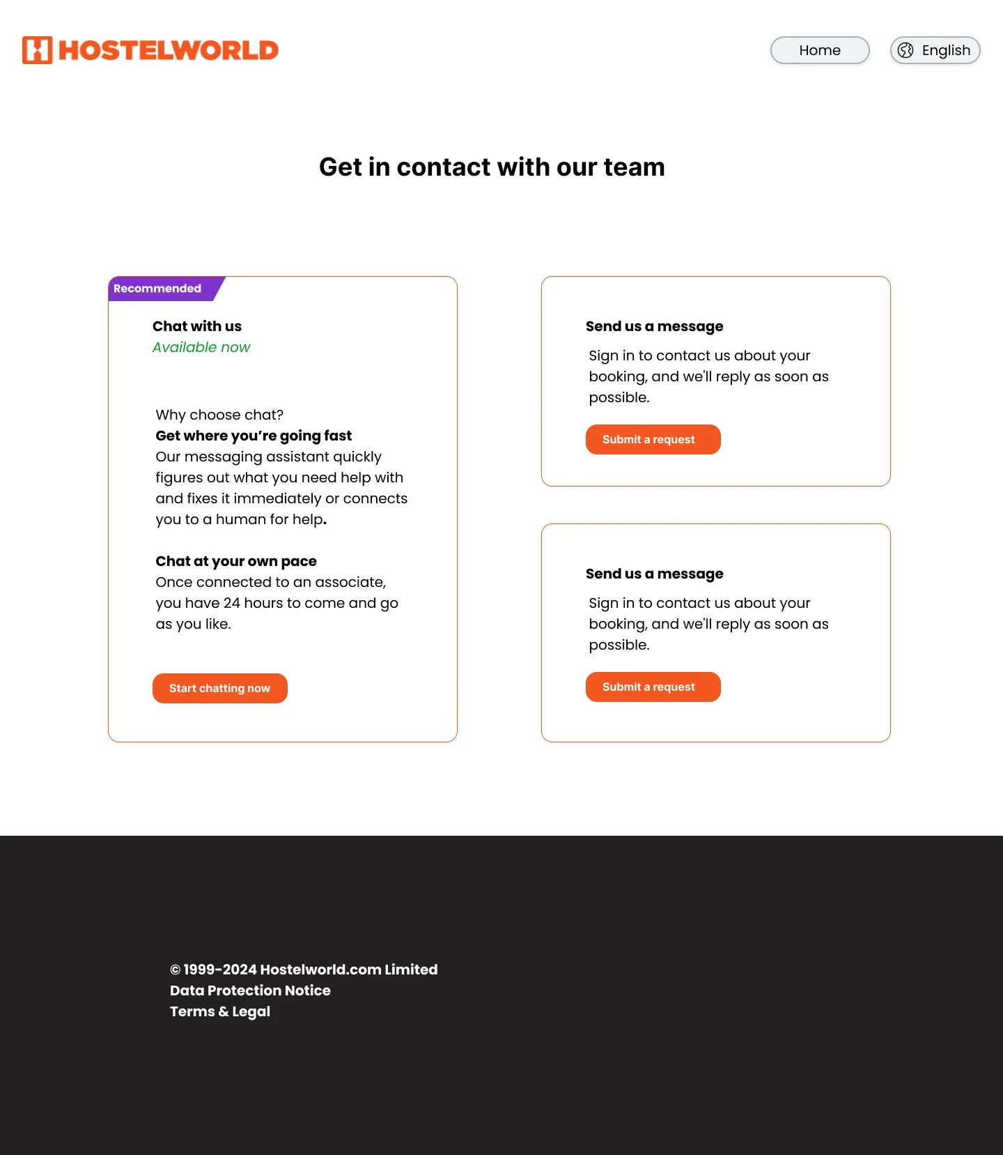
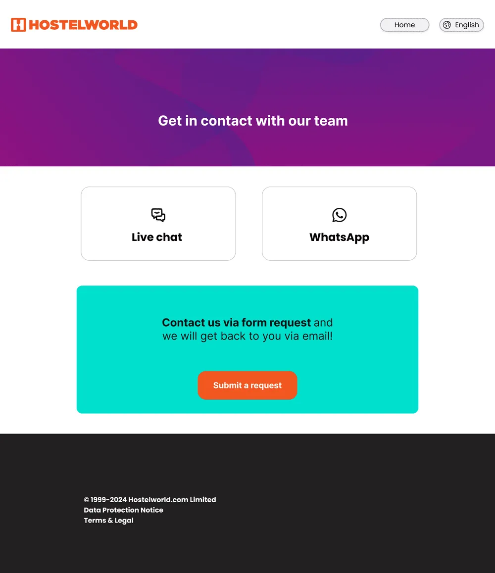
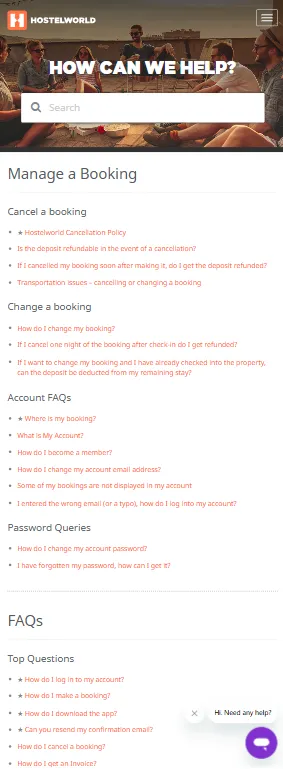
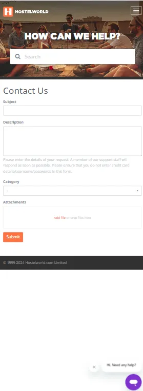
The Hostelworld Help Centre serves as resource and support for travellers. This project redesigned the Help Centre to align with the updated brand look, creating a seamless user experience. A key focus was adding an intuitive "Contact Us" page to make support easier to find, improving navigation, consistency, and user satisfaction.
Challenges
- Project scope
- Theme with limited editing options
- Low coding skills
Problem
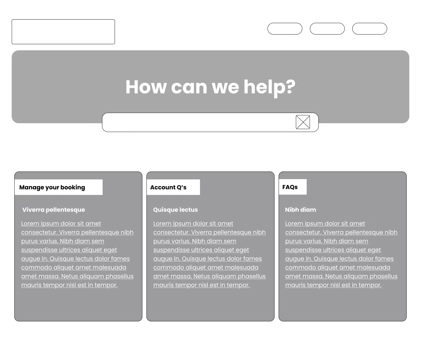
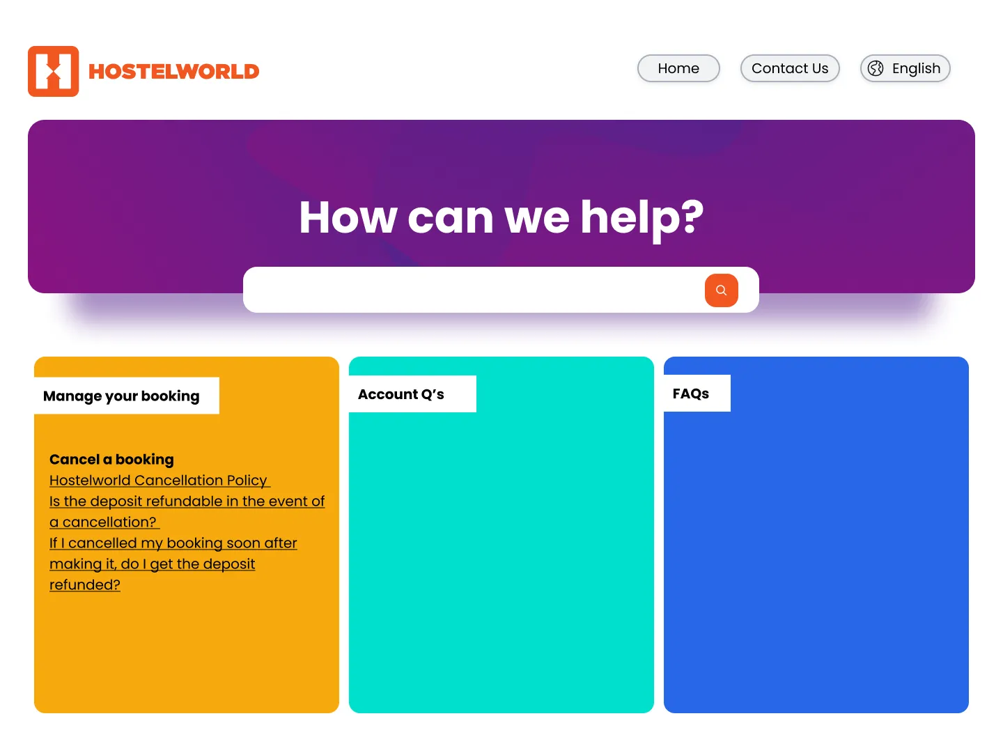
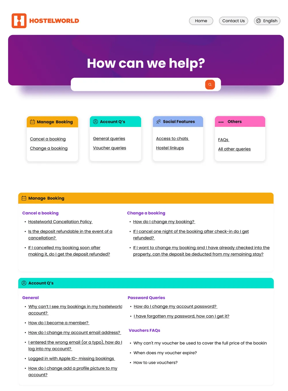
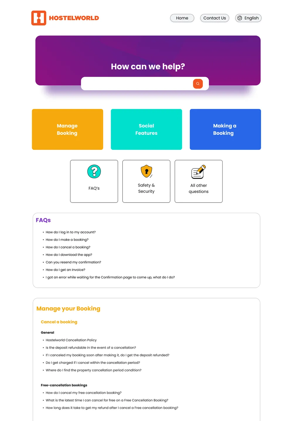
The original Help Centre page wasn't effectively reflecting Hostelworld's brand. Several key issues were identified: an outdated visual design, a lack of content hierarchy, unstructured and static information, hard to find support, and a poor overall user experience.
Solution
- Update articles
- Restructure page categories
- Visual align the page design with the brand
- Improve the mobile experience
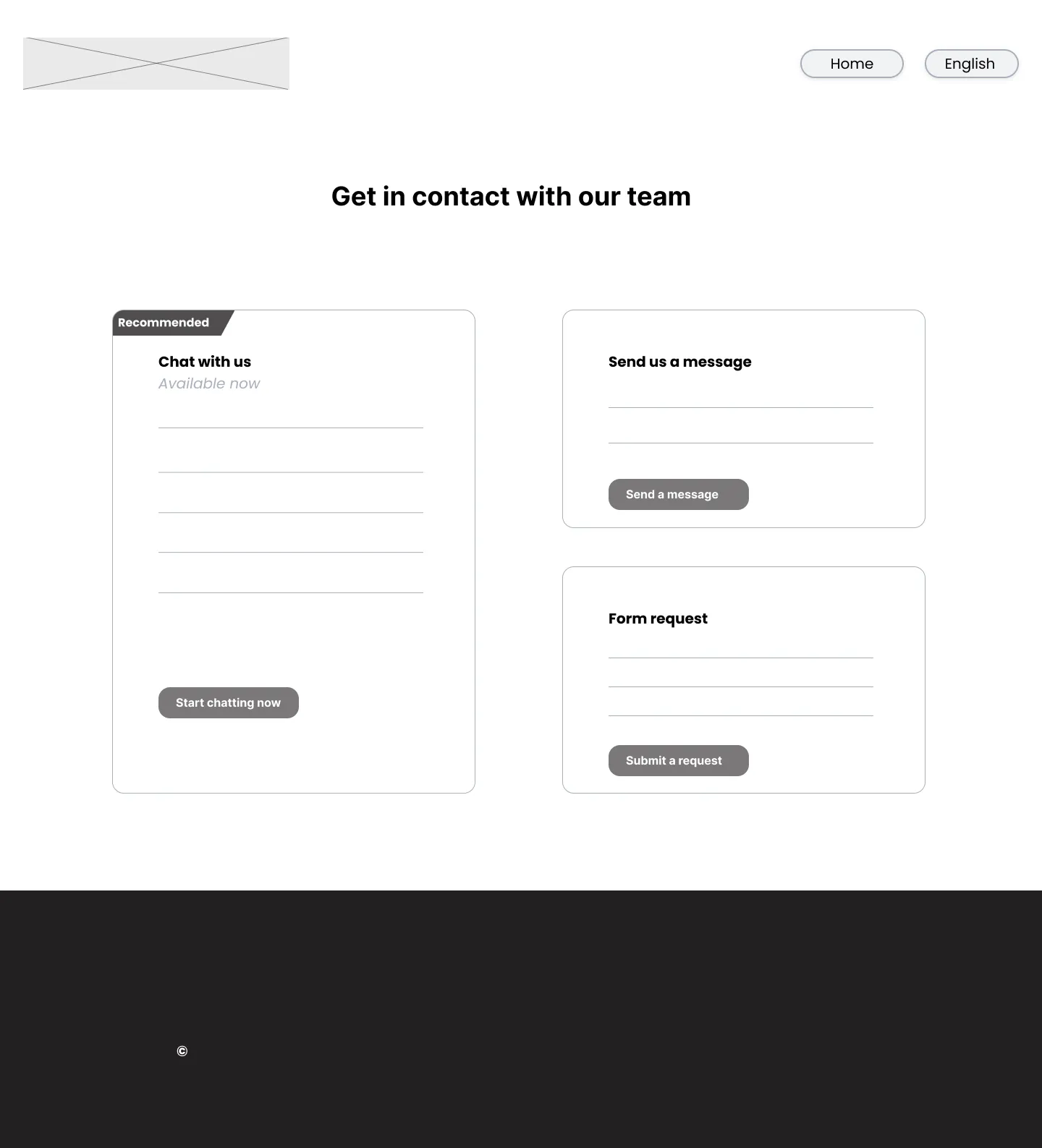
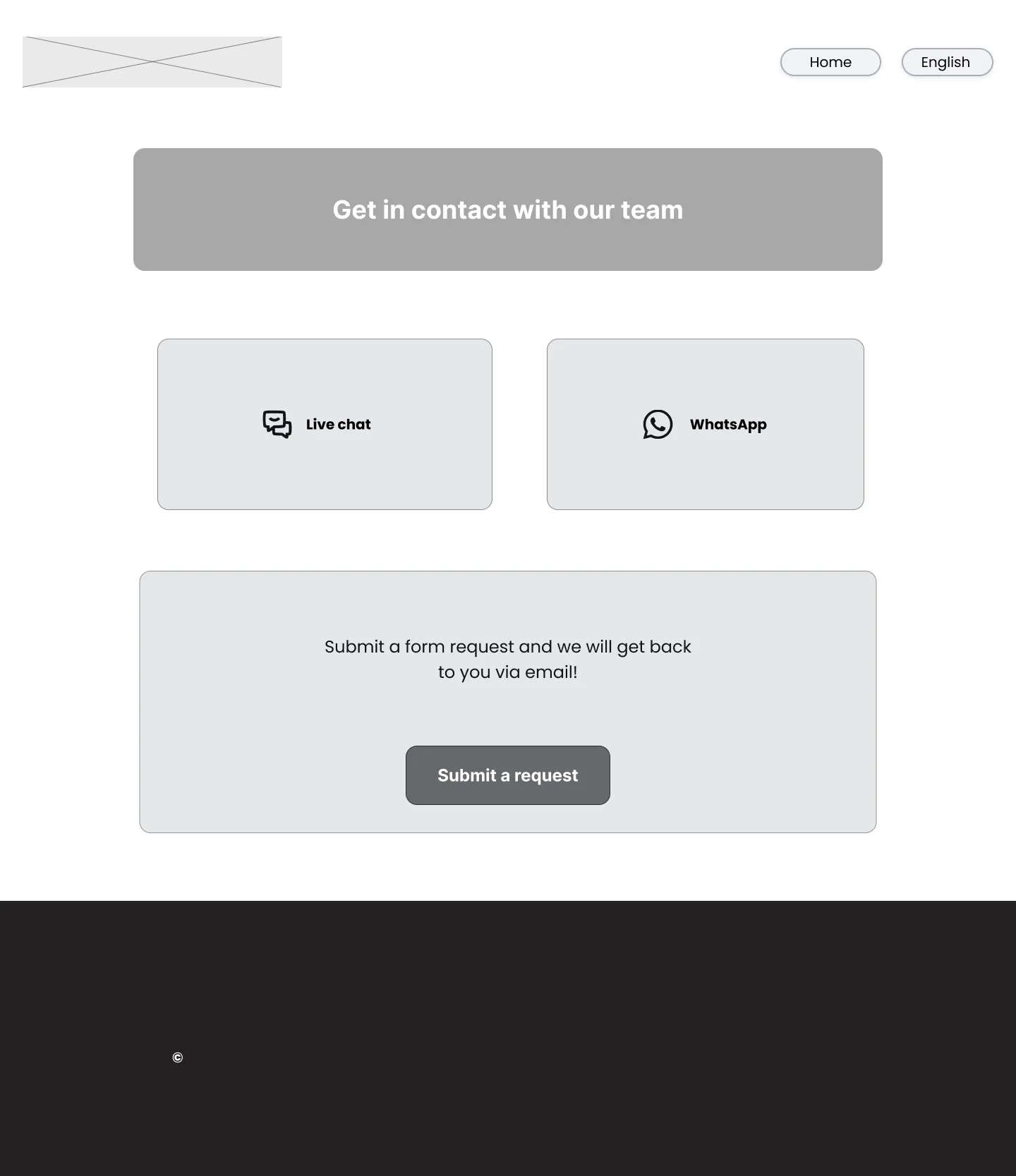
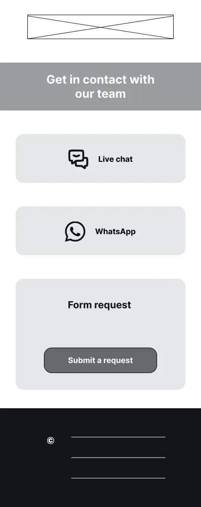
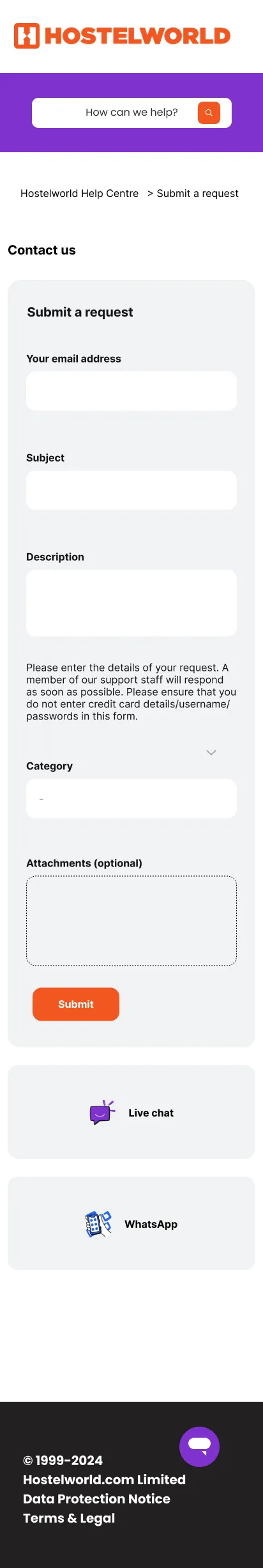
- Create a "Contact Us" page
- Introduce translation to over 15 languages
Competitor audit
- Hostelworld's direct competitor's customer support page were analyzed to identify trends in the market.
- Specific elements such as page layout, content hierarchy, imaginary, the use of icons, tone of voice and colour were taken in consideration.


Colours
Primary colour
#F25621
Neutral colours
#121417
#FFFFFF
Secondary colours
#F6A90E
#00E0CE
#CC0074
#2767E7
#7F32CD
Typography

Homepage
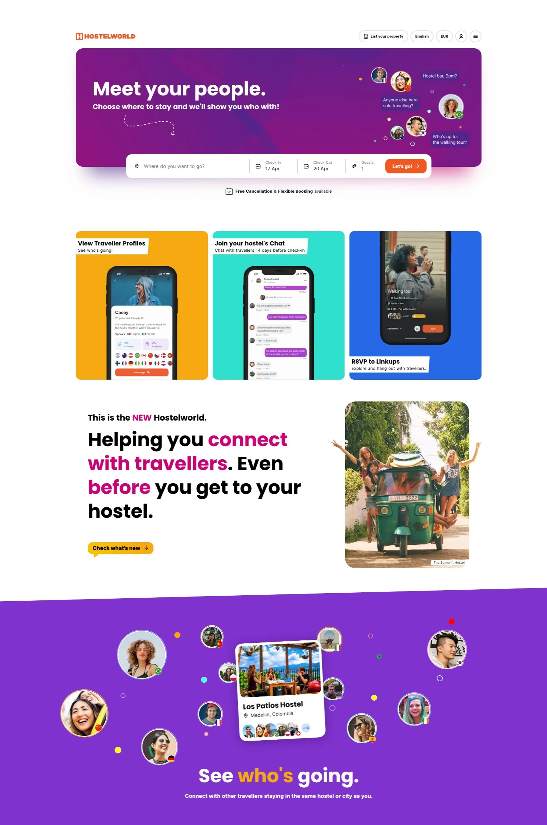
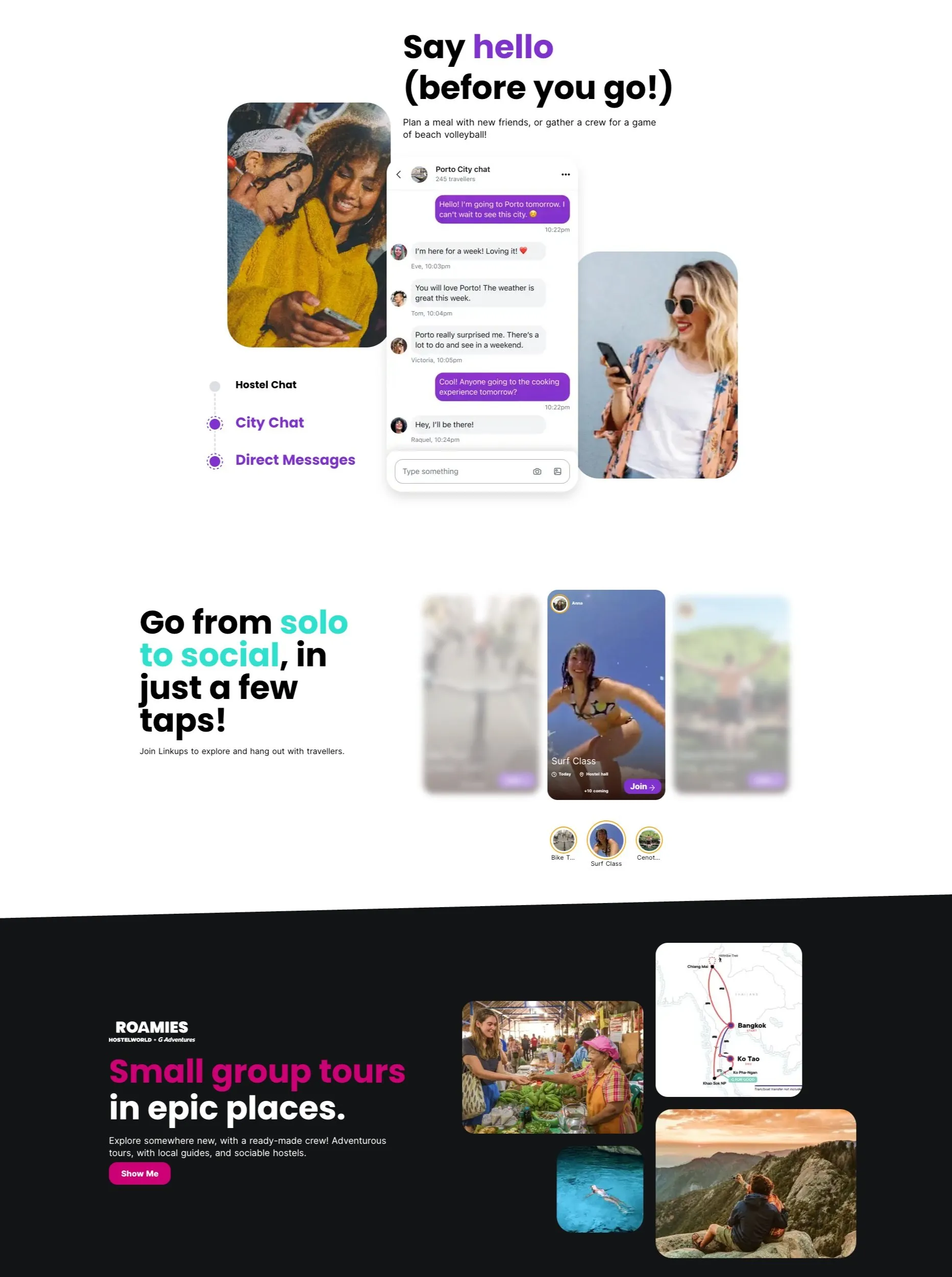
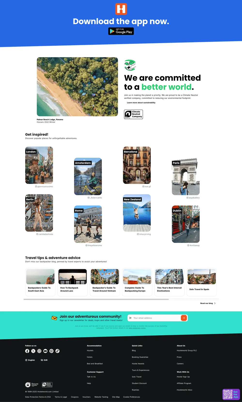
- The homepage was previously redesigned to highlight the social side of travel, focusing on helping users connect and share their experiences.
- The redesign introduced a new visual identity, including a vibrant colour palette and updated brand elements.
- The brand adopted a fun, informal tone of voice to better engage its audience and reflect a more community-driven tone.
Identified issues in the existing Help Centre
- Followed Hostelworld's Design System to select UI assets and design style.
- The hero buttons were outdated and didn't match current priorities.
- The hero section background image lacked relevance and emotional impact.
- Orange elements closely resembled red tones, conveying error or warning states.
- Content hierarchy and layout were unclear, making navigation challenging.
- Overall, the design didn't follow modern UX best practices, leading to a less intuitive experience.
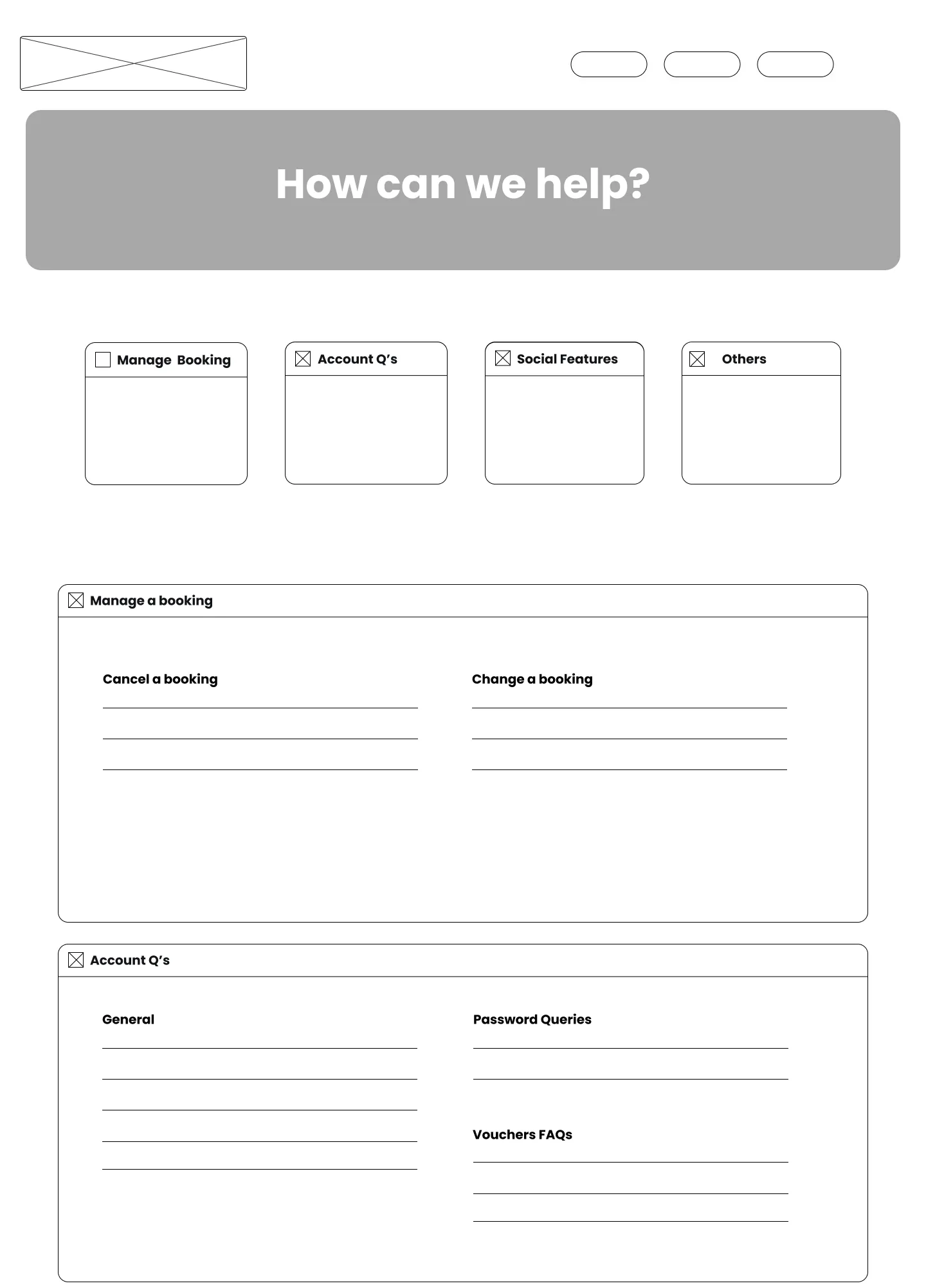
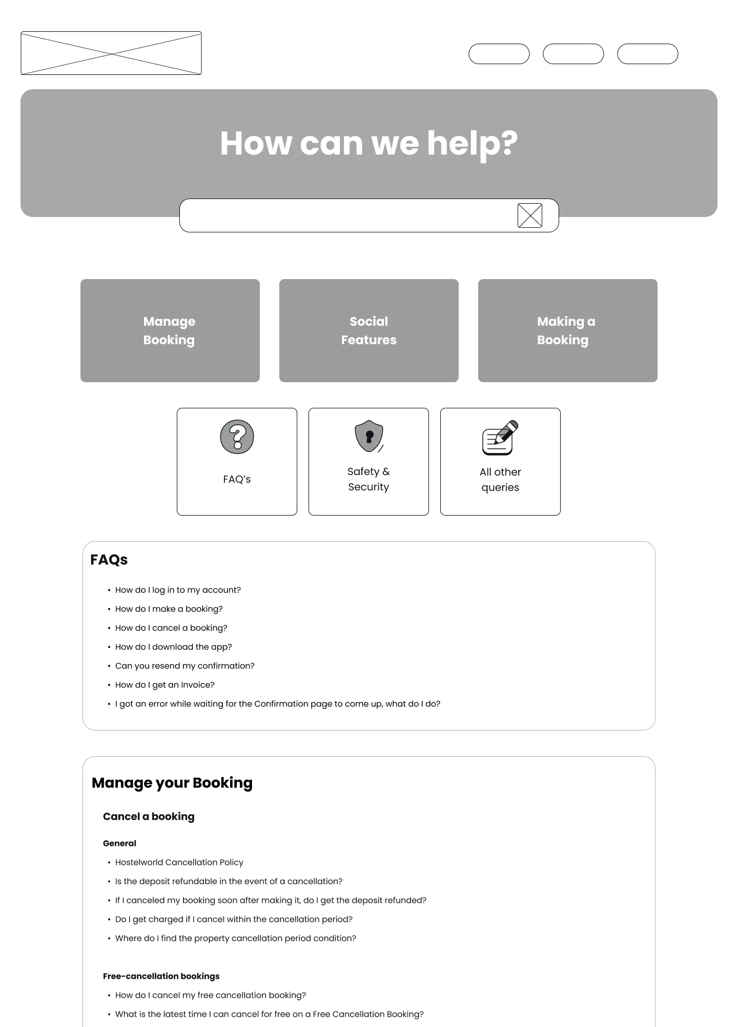
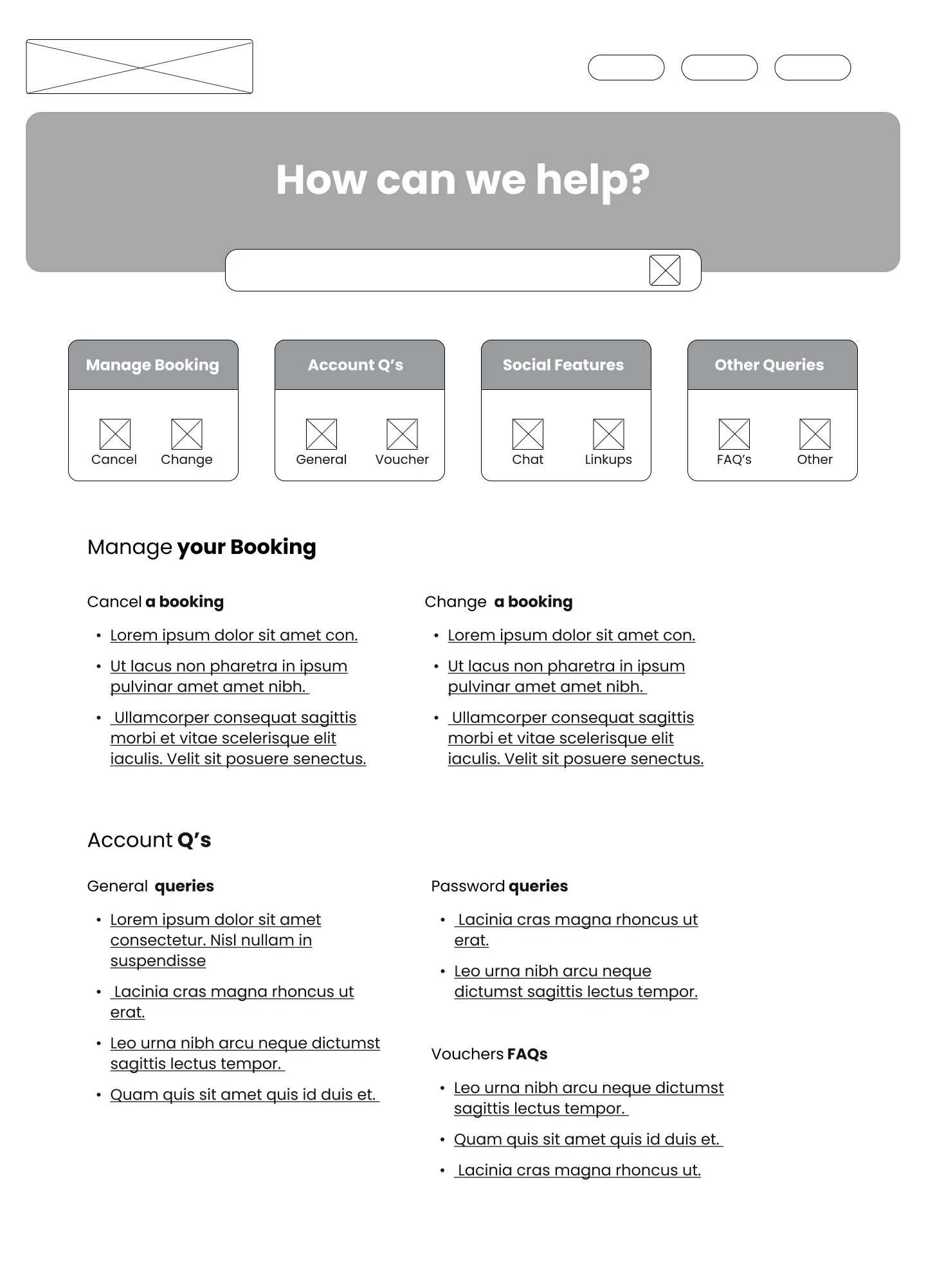
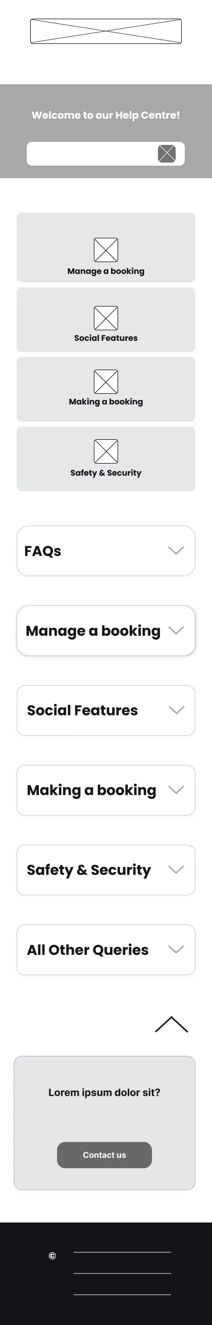
- Created low- and high-fidelity wireframes after reviewing the redesigned homepage and Help Centre.
- Worked with customer service to define key sections and categories.
- Designed a new "Contact Us" page based on project needs and competitor research.
- Aligned designs with the updated brand, improving clarity and accessibility.